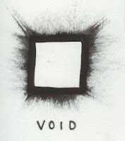
The crit was very beneficial, it made me realise the holes in my project and knowledge of what I was trying to produce, I fell now that my idea was on a small scale, not pushing any boundaries . Through talking with the people in my group I can now go away and re evaluate where I am with my good and how I plan to deliver it.
Showing posts with label Crit. Show all posts
Showing posts with label Crit. Show all posts
Thursday, 20 October 2011
Concept Crit 19/10/2011
Saturday, 15 October 2011
Wrap it up Crit
Strengths
Very strong design.
Linning up with packaging is smart.
Scaling range of packageing.
Colour pallet works well.
Proffesional asthetics.
Using acetate is a good finishing quality.
Areas for improvement
Would be more refined if the logo is vectorised. logo is complex, possibly too much.
Could focus a rocket imagery for logo.
Stay clear of live trace.
See how the design works when uncentred.
Monday, 10 October 2011
Logos Crit 5-10-2011
As a part of the crit I was instructed to pick my 10 favorite logos form the 150 I had designed, after choosing my favorite 10 images, a group of my peers collaborated in critiquing the 10 to choose one image for me to further develop for the next crit.
Crit Feedback//
- Revise spelling.
- Develop type /Font.
- Try reverse out.
- try making the 'O' clearer as another object/ symbol (as if it is in orbit)
- Possibly look at 3 dimensional images.
- and the use of the arrows, position/scale/line/quality.
 |
| The image chosen from the crit. |
Subscribe to:
Posts (Atom)


